The significance and usage of typography in web designing
Saturday, December 2nd, 2017

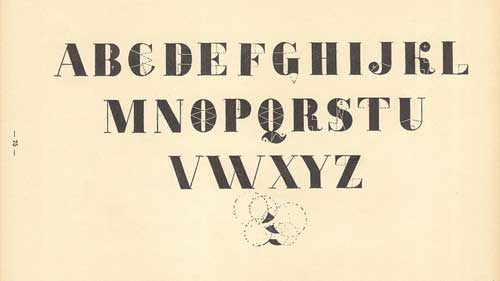
A one line definition of typography is the method of arranging type or text. The quality and style of typography used matters. It has two basic utilities that can have profound impact on your website:
- Typography can be an effective medium of communication: It can be regarded as a communicative art especially when it comes to web designing. In the technology of web designing you need to create an identity for yourself. The typography of your web page may yield that identity when used correctly. Typography has an immense potential to impact us in the psychological term. Each type conveys a particular message. Web design is like designing your work chamber where there are guest interfaces also. Even the color of your flower vase needs to match the rest of the aura of the room. If used correctly, it will be your fashion statement and will speak about the kind of character you are. Each and every web page is constructed with a particular objective like to sell a shoe, to distribute general information, to display personal talent and other. Typography in the ideal condition should vary from site to site. A good content written in well-chosen language can be enhanced or depressed with the typography your web designer uses.
- Typography engages a reader: Reading from a computer screen is not that pleasurable like that from a hard copy. A good typography will help you to read easily. Often, it has been seen that a good content has been avoided due to poor typography of the web design. It should be soft to the eyes and hence readable.
Following are some important parameters that the web designer needs to keep in mind when doing the typography part of the web page:
- Consistency: This is the primary element in any typographical design. Any particular website should contain similar formatting all throughout. Like the use of fonts, bullets, numbering, kernels and others. It helps people to read easily. A whole riot of different fonts and colors are not easy to the eyes. The colors in a website should blend nicely with the other elements and also create an appropriate statement for the business or the individual. In other words, typography should do justice to the content.
- Alignment: This is another important aspect. The content should look neat. A right or a left alignment creates a break and helps to read more easily.
- Highlight: The needful in the content needs to be highlighted carefully without making it look needy. The web designer needs to understand the website owner’s target and what does she wants. Color, typeface, fonts can be used to do the highlighting. Sometimes quotes and taglines are made prominent from the other text to catch the attention of the visitor.
The best typography in web designing is often considered as those where you can read through the entire website without any issues. The job of typography is to add an edge to the content without looking prominent itself.

Need a traffic boost for your website or blog? Learn how to increase your website traffic today at 10KHits!
Elevate your brand and bypass slow organic growth—buy cost-efficient website traffic for fast exposure.

Filed under: Tips & Tricks
Tags: design, increase your website traffic, typography, web design, website, website design
Exclusive Offer!
1,500,000 Points for $110 $68. If you're running low on points — don't miss out
limited time