How to Design Eye-Catching Pinterest Graphics That Convert
Tuesday, February 25th, 2025

When you’re scrolling through Pinterest, there’s nothing like a striking image to make you pause, take a second glance, and click through for more details. Whether you’re selling products, directing people to your blog, or building a personal brand, those engaging Pinterest graphics are often the first step in getting people hooked on your content. Think of them as your digital calling cards that spark curiosity and highlight what you have to offer. Pinterest is one platform you shouldn’t ignore when you’re building your presence online—especially if you’re aiming to leverage social media marketing to grow your business.
Define Your Purpose
Start every Pinterest design project by asking yourself: What’s my goal? Are you driving traffic to a blog post, promoting a new product line, or capturing leads for a newsletter? Having a clear purpose in mind helps you choose the right visuals, colors, and text overlay. If your primary aim is to boost conversions, your design will focus on strong calls to action. If you’re looking to grow brand awareness, you’ll emphasize consistent branding elements like colors and fonts. Take a moment to clarify your purpose before you jump into design mode—this will keep your creativity focused and effective.
Use Vertical Graphics
Pinterest is known for its vertical format, which gives tall graphics more screen real estate. The most common aspect ratio is around 2:3 (for instance, 600 x 900 pixels), but you can experiment with slightly longer pins if you’ve got more content. A vertical design naturally stands out as users scroll through their feeds. This layout also gives you enough space to display strong headlines, vibrant visuals, and any descriptive text you need. Be mindful to keep your text concise and well-spaced so it’s easy to read at a glance.
Choose a Color Palette That Pops
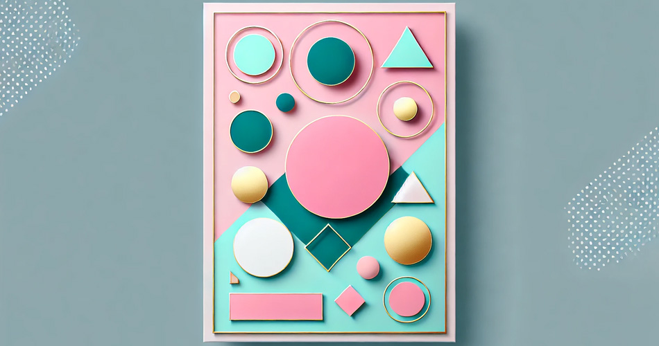
Color plays a massive role in catching someone’s eye. Cheerful hues like pink, coral, bright teal, or gold often stand out on Pinterest, where much of the audience gravitates to colorful, uplifting imagery. You can also explore trendy tones like muted sage greens or dusty pinks—especially if you’re aiming for a softer, more natural vibe. The key is to stay consistent with your brand, whether your look is fun and bright or sleek and minimal. Use no more than two to three primary colors, so your design stays cohesive and memorable.
Incorporate Readable Fonts
You might love that fancy script font, but if it’s hard to read on a small screen, it can cost you clicks. Your Pinterest graphics should be legible and scannable. Combine a bold sans-serif for your main heading with a simpler secondary font for smaller text. If you’d like to use a playful script, consider using it sparingly to accent keywords rather than entire sentences. By making your message easily readable, you’ll keep your audience’s interest and encourage them to click through to learn more.
Layer Images and Text Strategically
Pinterest graphics often feature a blend of photography, illustrations, or patterns along with text. The idea is to arrange elements so that your headline clearly stands out without obscuring the most important parts of your visual. A good trick is to use semi-transparent overlays in a complementary color, giving your text a high-contrast background. Position your headline in a way that naturally draws the eye from the top of the graphic to the lower section, where you can include a smaller detail or a call to action.
Add a Clear Call to Action
If you want conversions—sign-ups, purchases, or traffic to your landing page—you need to guide your viewers. A clear call to action (CTA) on your pin can be as simple as “Read More,” “Shop Now,” or “Download Here.” Make it visible and inviting without overpowering the rest of your design. Placing a concise CTA toward the bottom of your Pinterest graphic can create a seamless flow, where viewers read your intriguing headline first, glance at your visuals, and then feel compelled to follow that CTA to your site.
Align With Your Brand Identity
A cohesive brand identity gives people a sense of who you are and what you stand for the moment they see your pins. Think about your color scheme, fonts, photography style, or even signature design elements (like icons, borders, or certain shapes) that you can repeat across your pins. Consistency builds trust and recognition. The more you stick to your brand’s look and feel, the more your audience will remember you. Over time, loyal fans will know instantly when a new pin is from you.
Embrace Negative Space
Negative space (or white space) isn’t just empty space; it’s a powerful design tool. It helps create balance, draws attention to the text, and keeps your graphics feeling uncluttered. People on Pinterest often scroll quickly, so a crowded pin can be visually overwhelming. By leaving some breathing room, you let your most critical elements shine. Plus, negative space can give a polished, modern feel that aligns well with many popular Pinterest aesthetics. Don’t be afraid to simplify. Let a little emptiness do the talking.
Leverage Text Overlays on Lifestyle Photos
Lifestyle photos are incredibly popular on Pinterest because they help your audience envision how a product or idea fits into their daily life. If you’re promoting a new line of handbags, show someone happily using one in a real setting, then add a text overlay highlighting a key benefit or feature. This approach makes your pin relatable and inspiring. Position your text overlay carefully so it doesn’t clash with the subject in the photo. Use soft shadows or mild gradients behind the text for better contrast.

Experiment With Design Tools
You don’t need to be a professional graphic designer to create stunning pins. Free or budget-friendly tools like Canva or Adobe Express offer tons of ready-made Pinterest templates. Experiment with fonts, colors, and layouts until you find a look that suits your brand. Then, create a set of templates to keep your pins consistent. This also speeds up your workflow. Having a few preset designs helps you crank out pins quickly without sacrificing style, which is especially useful if Pinterest is a key part of your social media marketing efforts.
Optimize for Keywords and Rich Pins
Part of designing a successful Pinterest graphic is planning how it shows up in searches. Use relevant keywords in your pin title, description, and even on your graphic if it makes sense. For example, if you’re sharing a “Healthy Smoothie Recipe,” include those exact words on your pin image. Rich Pins also pull in extra metadata from your website, offering more context. This little bit of extra info can be a game-changer in helping your pins rank higher in Pinterest’s search results. Think about your overall social media marketing strategy and how you can integrate Pinterest SEO to make the most of every pin.
Analyze and Refine
After you’ve been posting pins for a few weeks, dig into your analytics to see which designs get the most clicks, saves, and engagements. Check your audience demographics, note any comments, and see if certain color schemes or layouts outperformed others. Sometimes the pins you least expect become the biggest hits. By tracking performance, you’ll discover patterns that inform your next round of designs. Maybe bolder headlines yield more clicks, or perhaps pins featuring real people perform better than flat-lay photos. Use these insights to iterate and refine, always working toward higher conversions.
Get ahead of your competition—tap into our advanced traffic exchange and broaden your audience.
When it comes to building a robust online presence, social media marketing is an essential component. By focusing on social media marketing best practices, you can craft eye-catching Pinterest graphics that resonate with your target audience and inspire them to take action. Whether you’re using bright colors, clear CTAs, or carefully chosen fonts, you can’t go wrong by paying attention to the details that make your pins pop.

Pinterest is a gateway to new ideas, products, and experiences. It’s a place where your perfect customer or fan can discover you with just one click. By following these strategies and putting your personal spin on them, you’ll be well on your way to designing pins that convert every time. Your audience is ready and waiting—now go captivate them with Pinterest magic.
Filed under: Tips & Tricks
Tags: social media marketing
Exclusive Offer!
1,500,000 Points for $110 $68. If you're running low on points — don't miss out
limited time