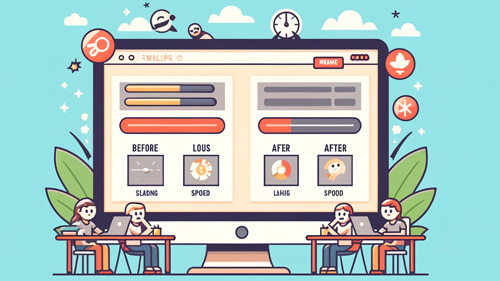
Drive More Traffic: Essential Tips for Image Optimization
Monday, October 21st, 2024

Looking for effective ways to speed up your website and attract more visitors? Optimizing your images is a crucial step in improving your site’s performance and search engine ranking. This comprehensive guide will walk you through the essentials of image optimization, helping you make informed decisions to enhance both speed and user engagement.
The Critical Role of Image Optimization
Why is optimizing your images so important for your website’s performance? Large, unoptimized images can bog down your site, leading to slow loading times and a poor user experience. This not only frustrates visitors but also negatively impacts your search engine rankings, as speed is a key factor in SEO. Moreover, optimized images take up less storage on your server, which can reduce hosting costs and improve server performance. Optimized images also reduce the bandwidth needed, which is particularly important for users on mobile devices with limited data plans. By improving load times, you enhance user satisfaction, reduce bounce rates, and improve the likelihood of visitors engaging with your content, thus boosting your SEO efforts.
Selecting the Right Image Format
What are the best practices for choosing the right image format? The format you choose can have a significant impact on the size and quality of your images. JPEGs are ideal for photographs due to their color richness and compression capabilities, while PNGs are better for images that require transparency or have text. For vector graphics, SVGs provide scalability without loss in quality, which is excellent for logos and icons. Recently, newer formats like WebP and AVIF offer even better compression and quality characteristics than traditional formats, potentially cutting the file size in half compared to JPEG or PNG. It’s essential to consider the nature of the image and the requirements of your website when selecting formats to ensure you are maximizing performance without sacrificing quality.
Mastering Image Compression Techniques
How can you effectively compress images to retain quality while reducing file size? Effective compression reduces the image file size without noticeably degrading its quality. Tools like Adobe Photoshop, GIMP, and online compressors like TinyPNG and Compressor.io offer fine control over compression settings, allowing you to balance quality and file size. When compressing images, it’s crucial to consider the context in which they’ll be used; a background image can often stand more compression than a product image. Advanced techniques involve selectively reducing the quality in less noticeable areas of the image to further decrease the file size. Regularly updating your tools and techniques as new algorithms emerge can keep your website at the forefront of speed and efficiency.

Implementing Responsive Images for Enhanced Performance
Why is implementing responsive images critical in today’s diverse device landscape? Responsive images adapt to the screen size and resolution of the device they are viewed on, ensuring optimal performance and appearance. This is done using HTML5’s <picture> element, which allows you to define different image sources for different screen sizes. By loading the appropriate image size, you reduce unnecessary data usage, which is especially important for mobile users. This adaptive approach not only speeds up loading times but also contributes to a better user experience by ensuring images look sharp on all devices. Employing responsive images is a forward-thinking strategy that addresses the needs of a growing mobile audience.
The Power of Lazy Loading
What benefits does lazy loading offer for your website speed and user experience? Lazy loading is a technique where images are only loaded when they enter the viewport (visible part of the web page), which significantly reduces initial load time and saves bandwidth. This is particularly useful for long-scrolling pages, where many images off-screen don’t need to be loaded right away. Implementing lazy loading can be as simple as adding the loading=”lazy” attribute to your image tags in HTML, which is now supported in most modern browsers. This method enhances perceived performance, as users can start interacting with the visible content sooner while off-screen images load in the background as needed.
Scale up fast by choosing to buy proven website traffic that elevates your conversion rate.

As we wrap up this guide, let’s remember that every element on your site contributes to a welcoming and engaging space, much like a well-tended garden that draws in website visitors with its beauty and care. Optimizing your images is like pruning and watering your plants—essential for healthy growth. It ensures that your garden, or website, is accessible, fast, and delightful for all who visit, encouraging them to stay longer and explore more. By continuing to nurture and optimize each part of your site, you’ll cultivate a vibrant and thriving online presence. Keep tending to your digital garden with love and attention, and it will surely flourish.
Filed under: Tips & Tricks
Exclusive Offer!
1,500,000 Points for $110 $68. If you're running low on points — don't miss out
limited time